Version control:
This feature remained largely unchanged due to its significance; comparing models is key to understanding how different configurations impacted results.

Torchlight is a web-based data visualization tool made to help people debug machine learning models. It displays metrics, graphs, and allows you to step through your model to see how these facets adjust in real time.
Machine learning models are incredibly information dense. For our intended users of the platform, namely students, information needs to be displayed in such a way that the dynamic visuals are easy to read and understand, especially since pinpointing the exact reason for something like overfitting, unexpected results, etc. becomes hidden behind the numerous variables.
1. Many moving parts: There are a variable number of layers, each with their own weights, biases, and other overhead like kernels, batch size, etc. Tracking every single one of these variables becomes a nightmare, especially without any visual aides.
2. Abstract concepts: For students who've never seen or tested a model before, the gap between the mathematical basis and real world application of the model becomes a barrier. Take the idea of a "layer" on a model - what exactly is it? What does it look like, how does it help a model's evolution? Having a more concrete idea of things like layers help make machine learning more intuitive, and debugging less like guesswork.
3. Disconnected metrics: Model layers feed into each other, acting as both input and output in a continuous flow. Providing one set of output metrics rather than specific metrics at each milestone the model isolates the model and hides the truth of machine learning models, which is that they are a very dynamic and evolving process. More importantly, when unexpected things happen during model testing, it becomes immensely difficult to pinpoint where exactly certain variables begin to change, impact results, or otherwise improve or degrade performance.
1. Decrease cognitive load by providing a modular way to view different information about the model.
2. Enable debugging akin to a debugger in a code IDE, a useful existing tool, to help students see incremental updates in their models.
3. Create a concrete visual representation of abstract objects such as layers and kernels.
I took to Figma to create a detailed dashboard that accomplished the above goals as best as possible. Being both the only UI designer on the team while also being a programmer gave me a unique perspective on the problem; I understood firsthand which parts of machine learning felt so cryptic and difficult, so I kept those first-timer challenges in mind while designing the initial dashboard for this 24-hour sprint.
I followed the convention of a zoned dashboard with three main zones, organizing controls, visualization, and metrics.
control panel
sandbox zone
metrics dashboard
Control panel:
A Version Control panel, allowing you to save numerous versions of a model with different parameters. This allows students to go back to and compare different models with ease. Users can label and color code them for easy recognition.
An Active Data panel lays out the visual structure of imported data sets. This helps error prevention, allowing users to see what data is being trained on and actively referenced.
You can also change the color scheme at the bottom per user preference.
Sandbox zone:
In this clickable section, users can see layers, weights, biases, and other layer-specific information appear as they step through. This mock flow diagram shows just an initial layer, a multiplication layer, and an optimization algorithm being applied.
The user can drag and zoom as they please with the provided control panel.
We've directly addressed the need for a concrete visualization of layers with this panel; by making layers movable and labeled, we hope that users can more clearly understand what a layer consists of and how each part of the model feeds into the next.
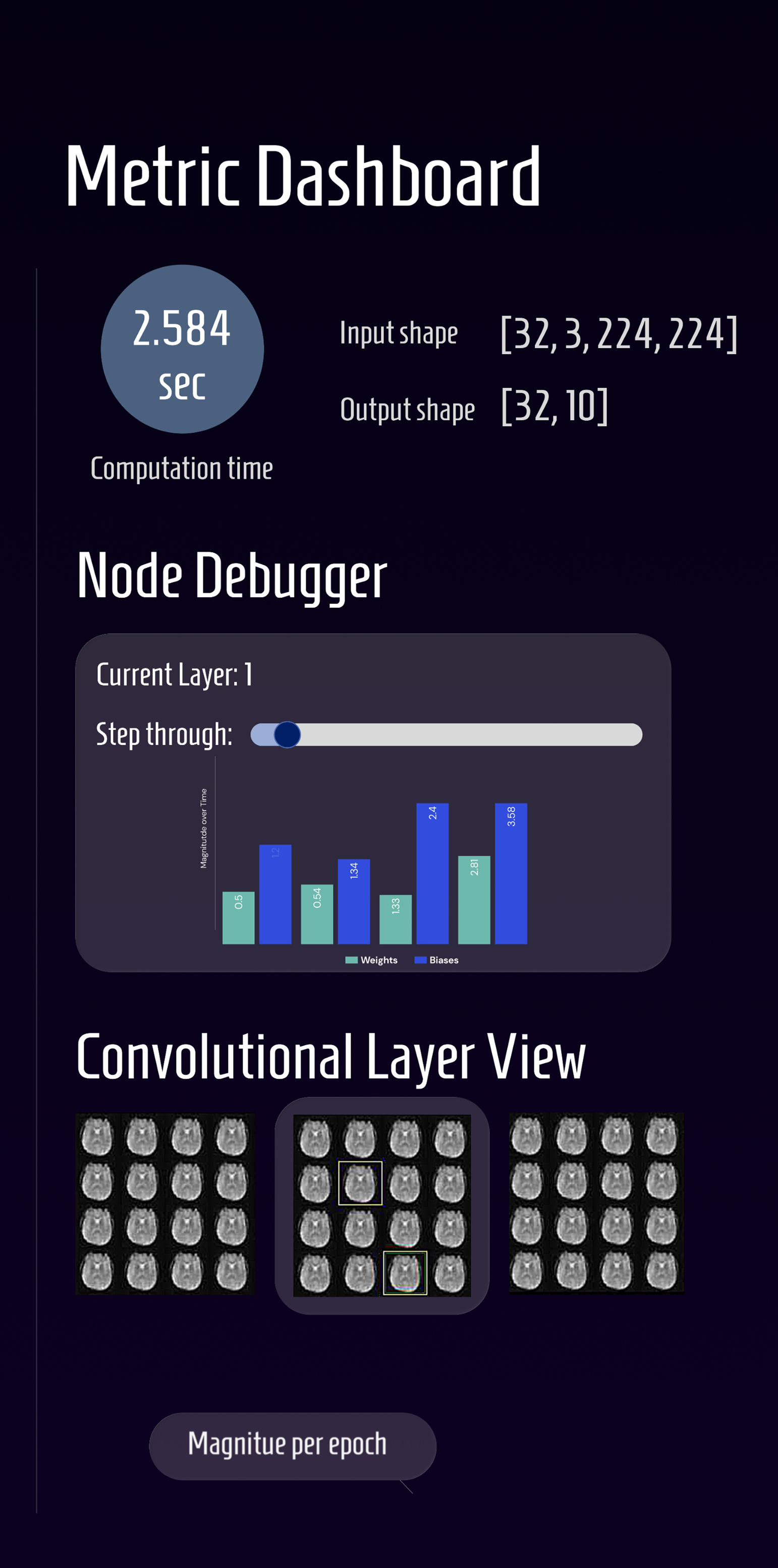
Metric dashboard:
This is the section for model behavior and performance. Where the sandbox provides layer specific information, this section allows you to see the dynamic variables over time.
The most pertinent metrics, the computation time, input and output shape are at the very top, with a "Node" (Layer) debugger below it. It's equipped with a slider allowing users to scrub through epochs and a bar chart of the evolving weights and biases, addressing the problem of disconnected metrics; the panel connects layer structure to dynamic behavior of the model.
For convolutional (image-based) neural networks in particular, we provided a carousel view of the different matrices. In the mockup, the current layer of radiology images are highlighted with the before & after layers on either side, allowing the user to see the smooth flow of change between the convolutional layers.
Below it comes more metric graphs for things such as backpropagation with epochs, and gradients, making unexpected behavior easy to identify.
A dark-mode UI was chosen as the default, following the convention of most IDEs; a dark background with colorful data nodes are visually easier to see and helps the different panels stand out.
The default color scheme of purples, blues, and greens maintains cohesion while allowing warmer tones (like the green "Initialized" indicator or yellow highlights) to draw attention.
For typography, I chose Homenaje for its readability and how it complements the data-heavy visuals while providing a modern feel.
As both the UI designer and frontend developer for this project, I had to turn my design decisions into engineering decisions all 24 hours. Our backend engineers transformed PyTorch tensors into object classes (Python based OOP). This made it easy to access and visualize certain variables. They created two custom classes; Node class objects holding layer information, and Edge class objects holding the connections to other layers.
To create our dashboard, I translated these OOP objects into interactive React components.
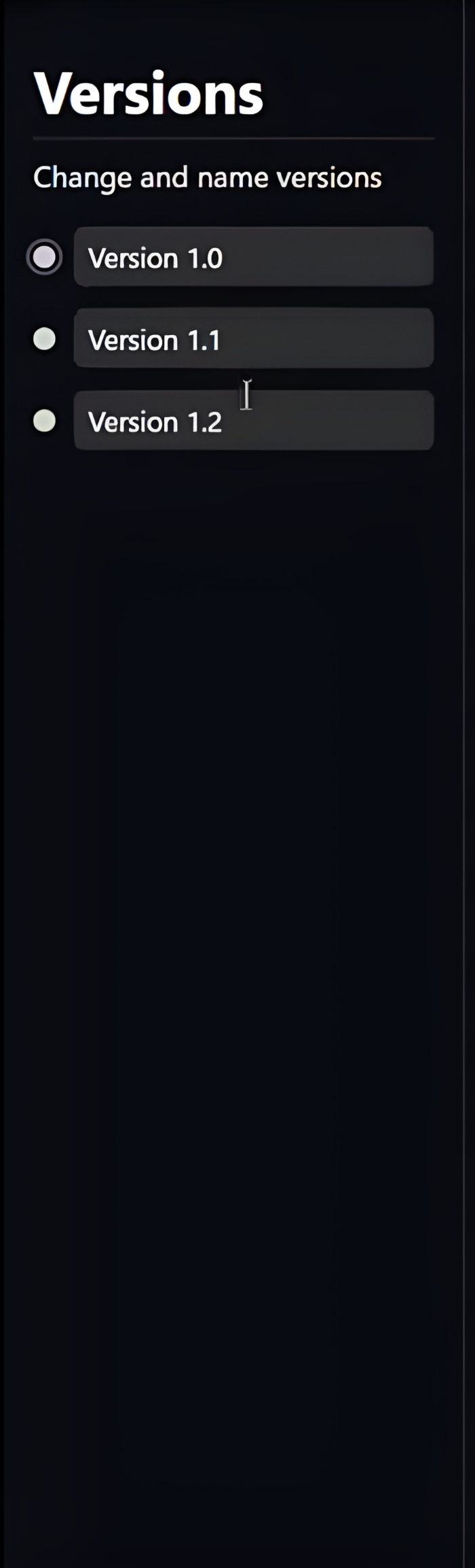
version control panel
Version control:
This feature remained largely unchanged due to its significance; comparing models is key to understanding how different configurations impacted results.
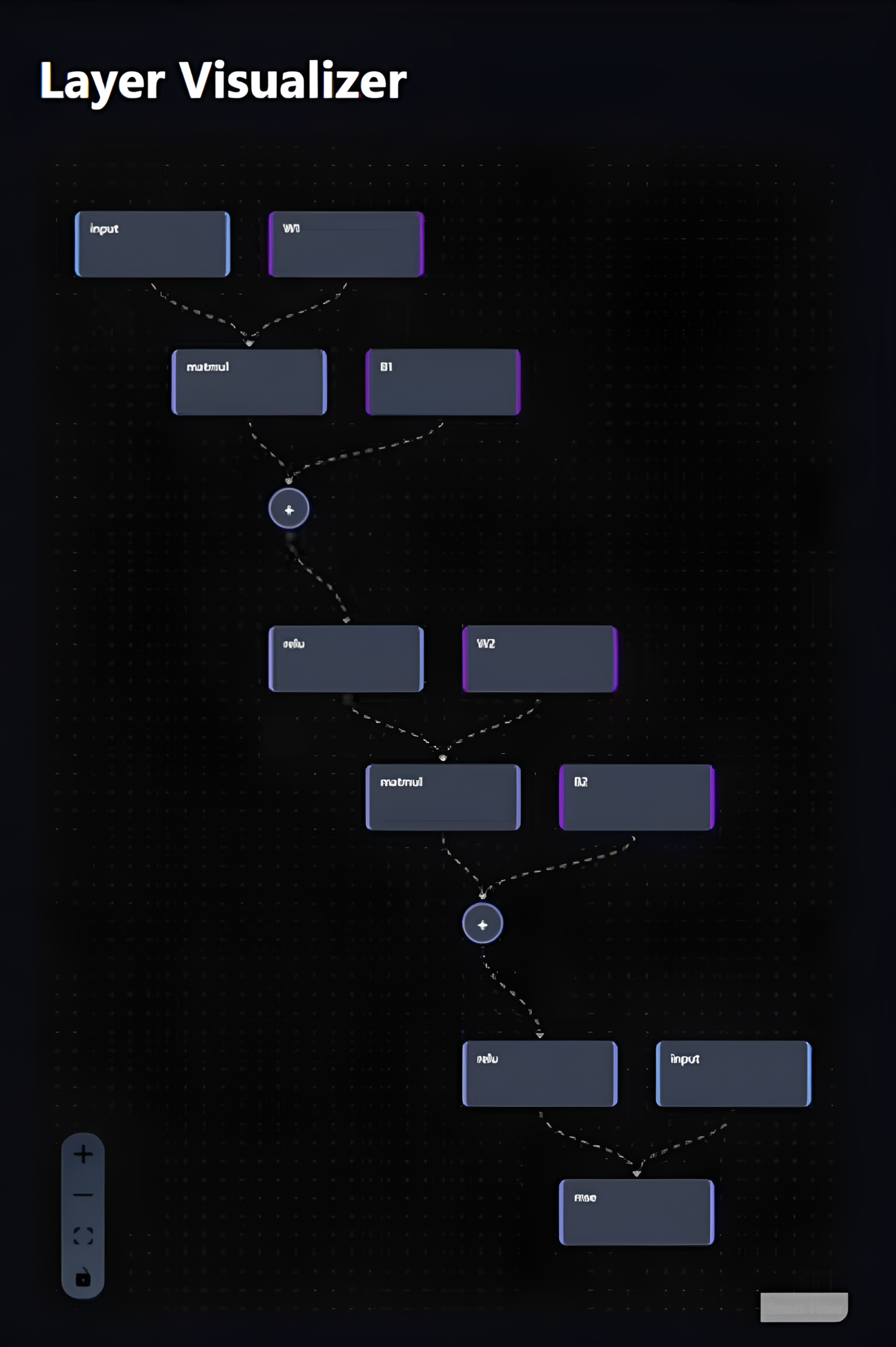
layer visualizer with node connections
Layer visualizer:
For the sandbox feature, I used React (JavaScript) as well as regular web technologies (HTML/CSS) to create the visuals. I mapped Node objects to square layers containing text of all its attributes, and had the Edge objects connect each layer visually via dotted-line flow animations, making the connections clear.
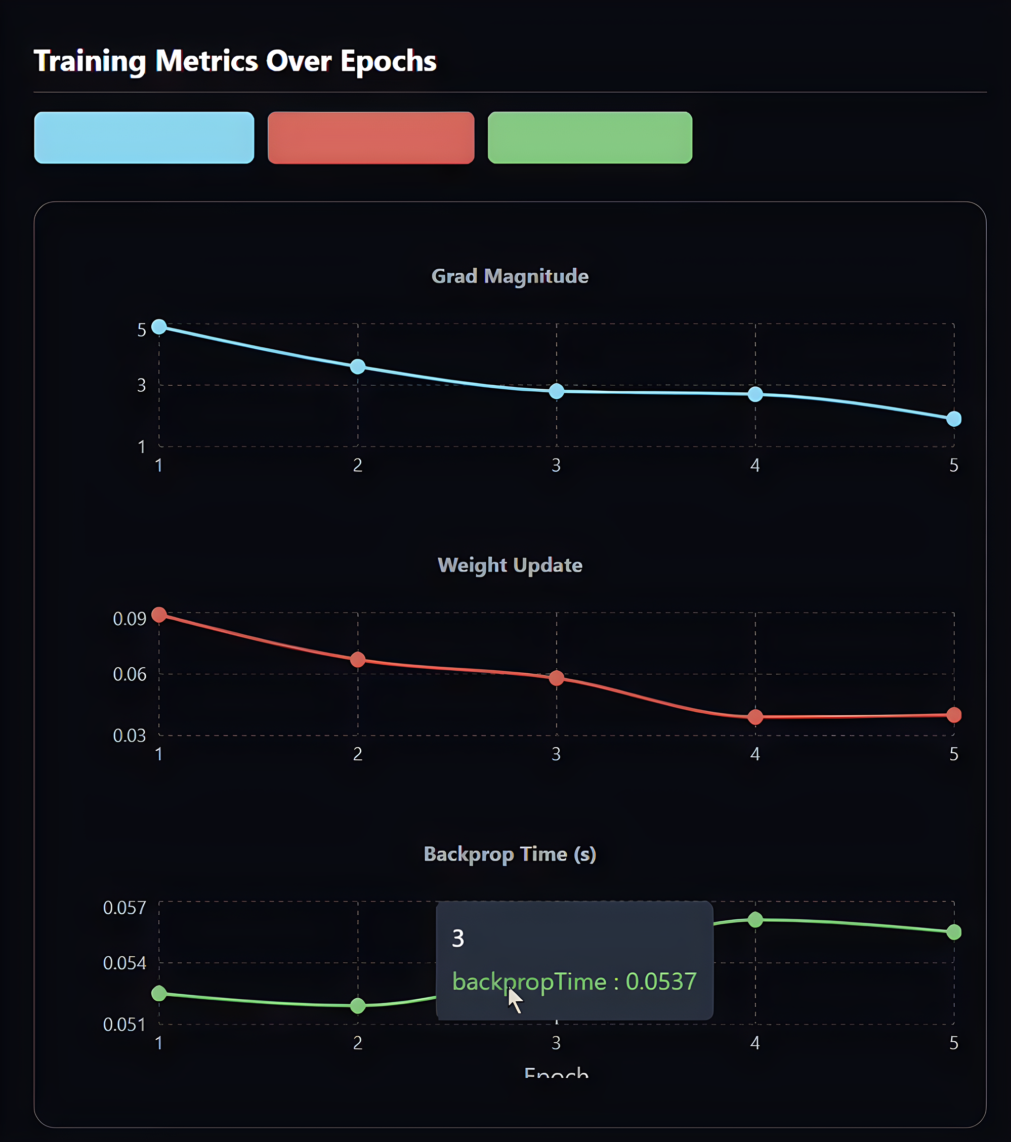
metrics dashboard with interactive graphs
Metrics Dashboard:
We kept the core three (time, input and output) at the top, with an abundance of graphs now taking up the panel. Variables shown in the graphs were easy to extract from the objects, hence the many interactive graphs featuring weights, biases, epochs etc.
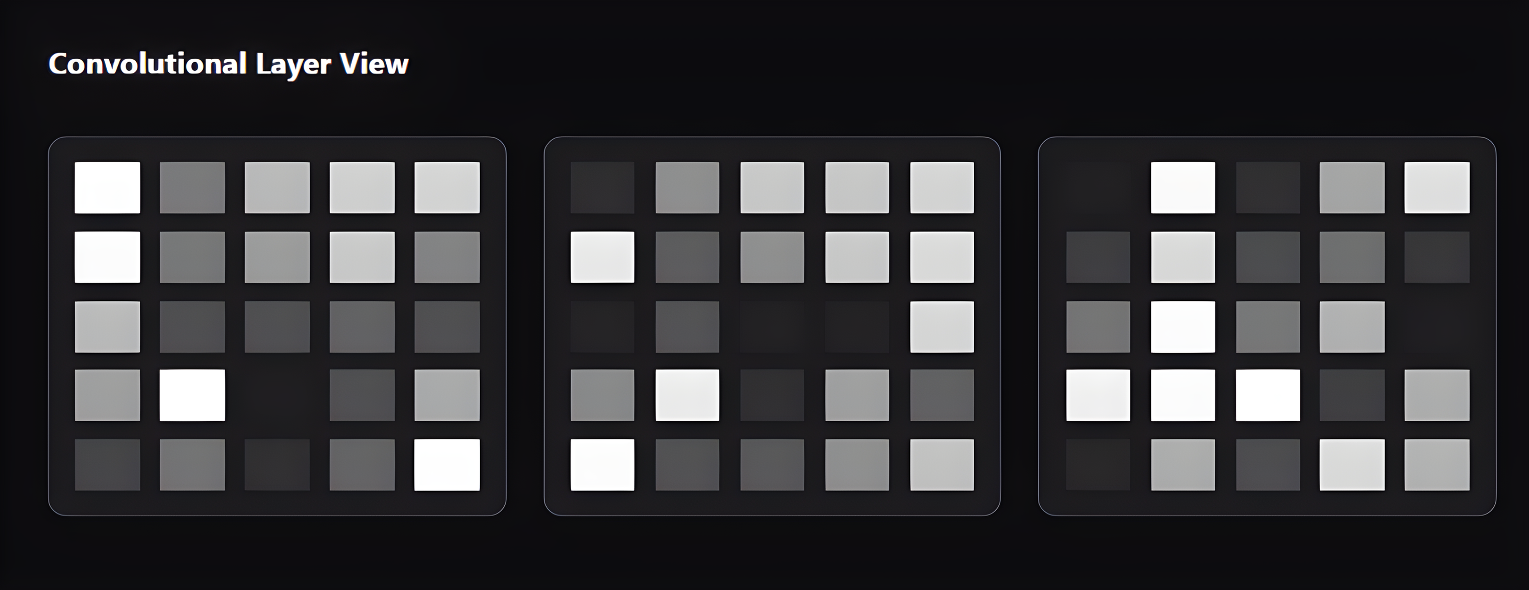
kernel carousel for CNN visualization
Kernel Carousel:
We also determined that the kernel carousel for CNN models was essential to aid visualization of each layer. Color blocks stood in place of images for sheer size and clarity constraints.
Hover statistics: I added pop-up panels to graphs when a user hovered above a bar; they proved useful for quick comparisons and statistics.
Animated data flow: A dotted line flow animation using CSS brought the abstract 'feeding' of variables into layers to fruition; the movement helps understanding of tensors moving through the model.
The Active Data panel would have unnecessarily cluttered the clean UI, and variable comparison graphs (as shown in the Figma dashboard) would have defeated the purpose of making the machine learning model more modular and easy to debug.