TorchLight
- Timeline
- Under 24 hours
- Role
- UI/UX Designer, Frontend Engineer
- Status
- Hackathon build (V1)
- Project Tags
- B2C, Data Visualization, Dashboards
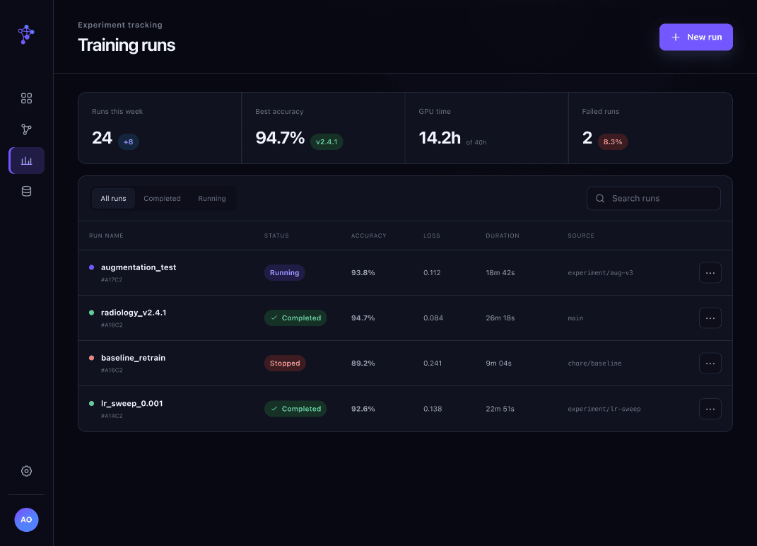
TorchLight is a web-based visualization tool that helps students debug machine learning models. It surfaces a model’s metrics, structure, and behavior, and lets users step through training like a debugger in a code IDE. As the team’s only designer and its frontend engineer, I designed the dashboard and built it in React in under 24 hours.
The Problem
Most students don’t touch machine learning until university, and when they do, the gap between the math and the actual model is wide. What is a layer, a kernel, an epoch? Models are dense with moving parts: layers with their own weights, biases, and kernels, all feeding into each other. Yet most tools offer one final set of output metrics. When something goes wrong, like overfitting or unexpected results, finding where it started becomes guesswork.
Formal research wasn’t feasible in 24 hours, so I asked my team, friends, and other students at the hackathon what made ML so hard. Three themes came up: abstraction, varying experience levels, and clarity.
Design Goals
Reduce cognitive load
Modular panels for different kinds of information.
Enable step-through debugging
Students can watch the model change incrementally.
Make the abstract concrete
Layers and kernels get a visible form.
The Dashboard
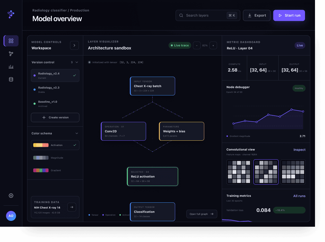
I organized the dashboard into three zones. A control panel holds version control, so students can save, label, and color-code model versions to compare. A central sandbox visualizes the model’s architecture: squares for layers, circles for numeric factors like weights and biases, ovals for algorithms, all connected by flow arrows. A metrics dashboard puts the essentials first (computation time, input and output shape), followed by a node debugger with an epoch scrubber, and a carousel showing convolutional layers before and after.
Key Features
- Version Control Panel
- Saves snapshots of a model so students can backtrack and compare configurations. Versions stack as you create them and are color-coded for quick recognition.
- Layer Visualizer
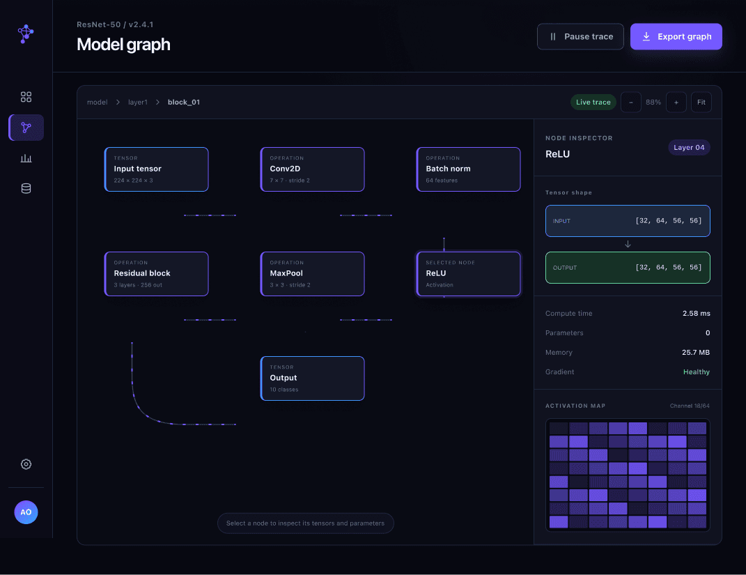
- A sandbox that turns model architecture into something tangible. Squares represent layers, circles represent numeric factors like weights and biases, and ovals represent applied algorithms, all linked by flow arrows. A status indicator shows the model’s state and initial size, and zoom and pan controls let users explore at their own pace.
- Metric Overview
- The most important numbers come first: computation time, input shape, and output shape, presented in a simple, readable layout.
- Node Debugger
- A scrubber lets users step through the model layer by layer, while a live bar chart shows how weights and biases change. This connects the model’s structure to its behavior over time.
- Convolutional Layer View
- For image-based models, a carousel highlights the current layer with the layers before and after it on either side, so students can watch images transform as they pass through the network.
- Animated Data Flow
- Dotted-line animations between layers show data feeding from one stage to the next, making the abstract idea of tensors moving through a model visible.
- Hover Statistics
- Hovering over a graph’s bars reveals exact values for quick comparisons without cluttering the view.
From Figma to React
Our backend engineers converted PyTorch tensors into Python classes: Nodes holding layer data, and Edges holding connections. I mapped these directly into React components, with Nodes as layer cards and Edges as animated dotted lines that show data flowing between layers. I added hover tooltips on graphs for quick comparisons.
Scoping meant making cuts. I dropped the Active Data panel and the variable comparison graphs, since both added clutter that worked against the goal of a modular, readable debugger.