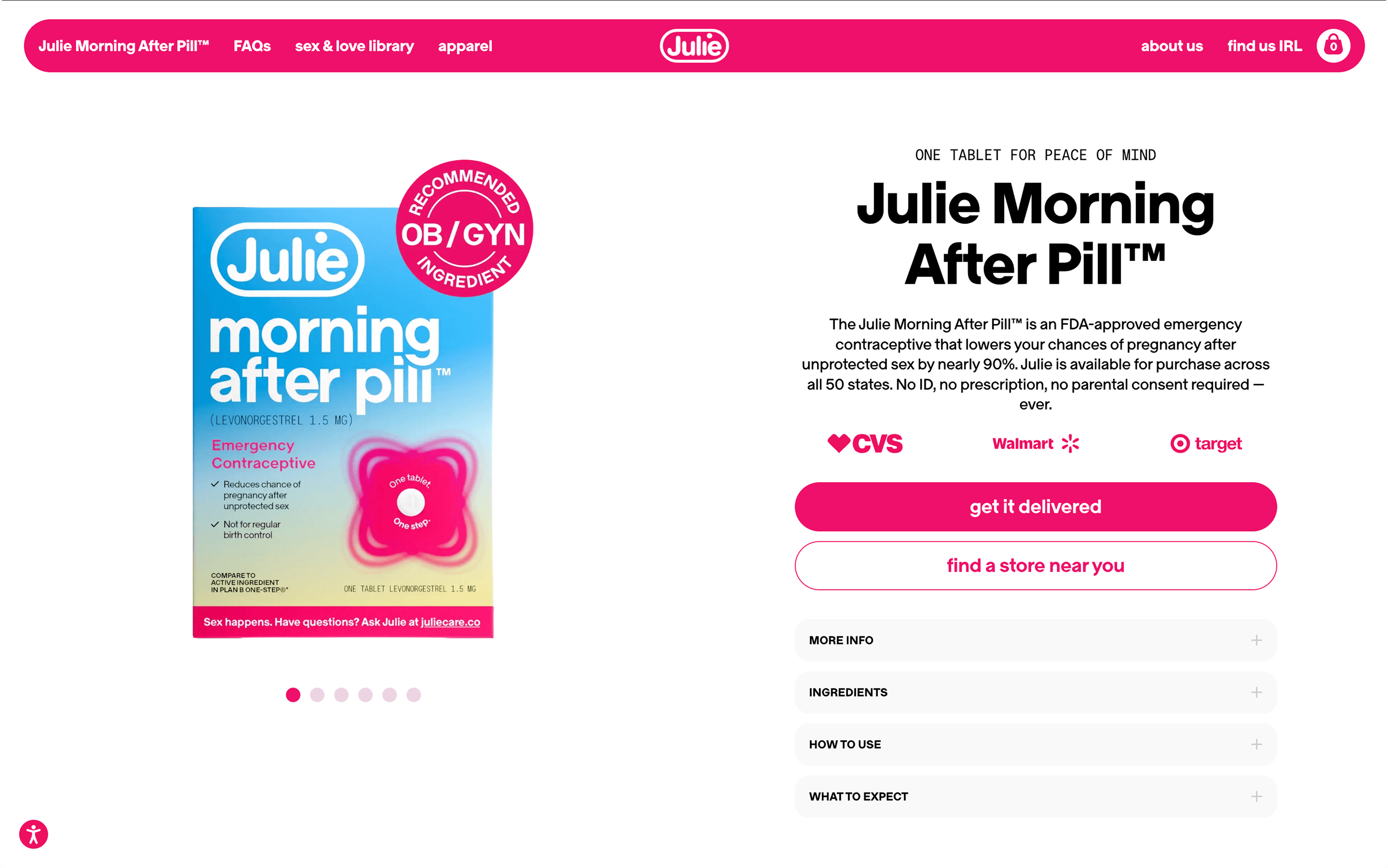
Julie Products
- Timeline
- Sept. 2025 - Feb. 2026
- Role
- UI Intern
- Status
- Site shipped
- Project Tags
- B2C, human-AI interaction, UI Design
Julie is a women’s consumer healthcare startup on a mission to become the one-stop shop for women’s reproductive and sexual health. Alongside a team of 9 UI interns and directors at Julie, we overhauled the website to align with newly defined company goals, including a resource hub integrating medical expertise, AI assistance, and culturally relevant content for AFAB users.
Context
The Opportunity
- 190k site sessionsover 6 months
- 350k site visitorsover 6 months
- Organic Web Searchas the top site traffic producer
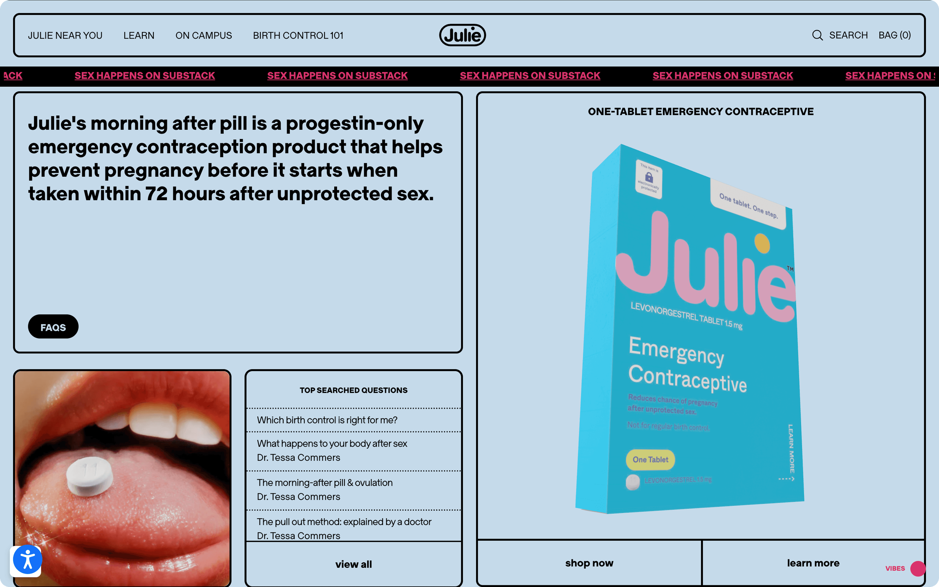
Julie was already an established consumer brand with an engaged audience, much of it online. But its site served mainly as a product page for its two core products: emergency contraception and cold sore gel.
Julie saw an opportunity to grow beyond that and become a trusted partner in women’s reproductive health, with a site that offered education, answers, and support, not just products.
The new mission was simple:
“In a couple of years, when a college student has an uncomfortable question about sex, a friend says ‘just ask Julie.’”
Julie outlined three goals for the site overhaul:
Empowerment
Promoting shame-free information on confidence and everyday care for women, not just medical advice and crisis management.
Credibility
Keeping medical accuracy and clinical rigor at the forefront of services provided, including articles, questions and their new AI chat service, also named Julie.
Brand
Maintaining user trust in not just Julie’s products, but in Julie as a brand as they transition from being just a consumer product to the “one-stop shop” for women’s health, converting site visitors into customers.
Branding & Visual System
The starting point
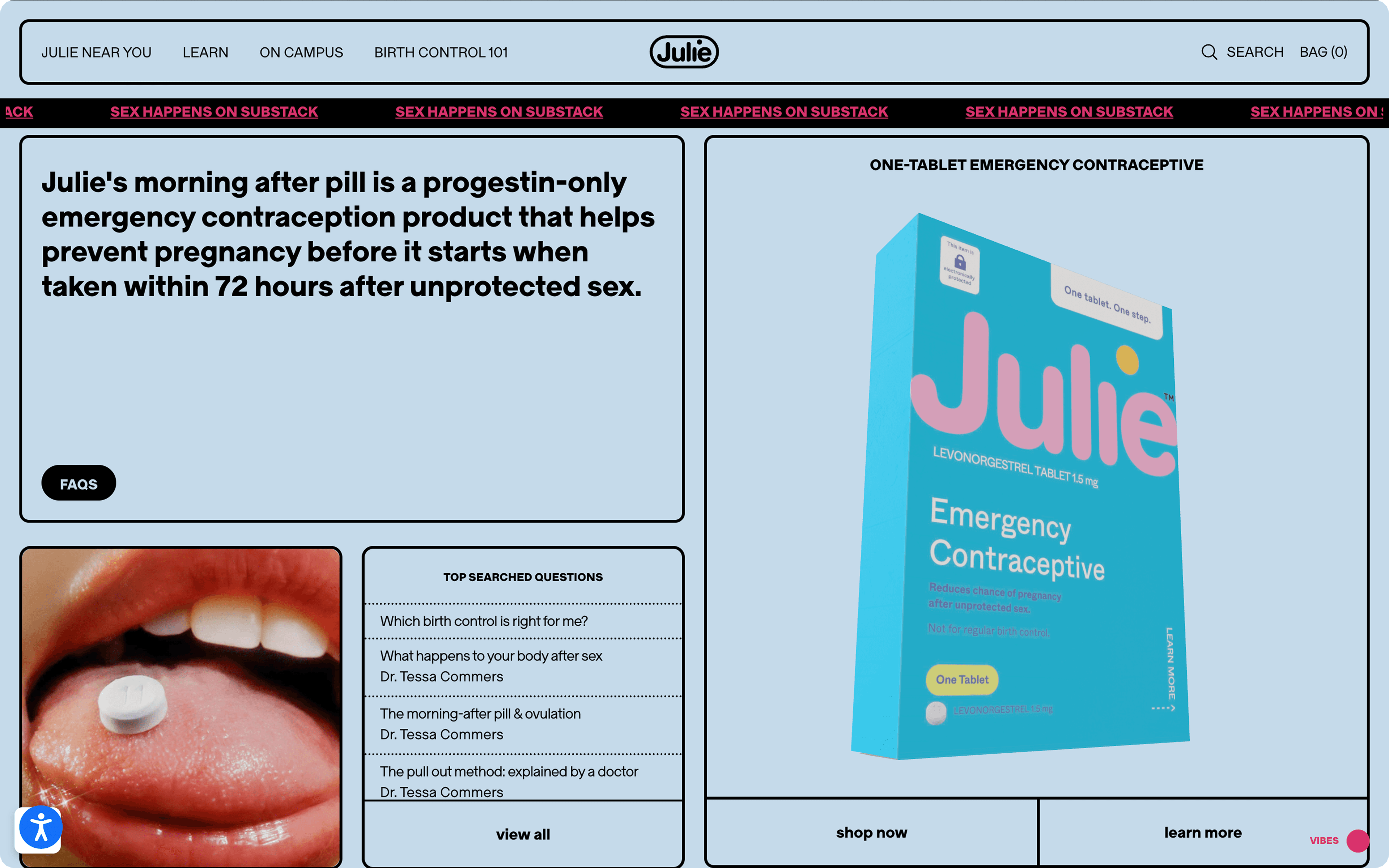
The original site relied on flat colors, rigid grid layouts, and a clashing palette of blue, black and pink that felt neither cohesive nor inviting. Despite the attempt at 3D graphics, like the pill box, the overall impression was product-driven and corporate, strongly disagreeing with the approachable, supportive presence Julie wanted to build.
First iteration
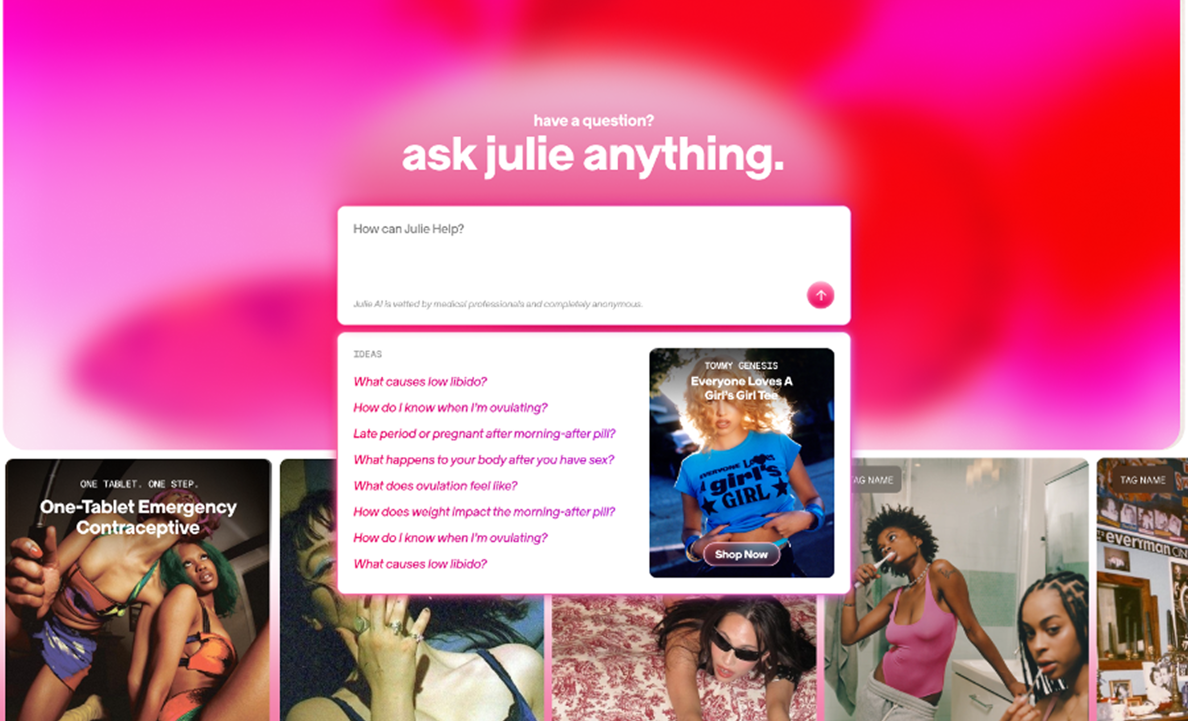
The first direction introduced pinks, purples, and oranges alongside revamped 3D graphics. While warm and energetic, the highly saturated palette created visual noise and conflicted with Julie’s existing packaging and brand identity, making a palette shift necessary.
Other bright and quirky imagery, like those used on the article covers, as well as more novel 3D renders of personas, jewelry, and unrelated objects also posed the issue of credibility, covered in more detail in the next section.
Grounding in the core product
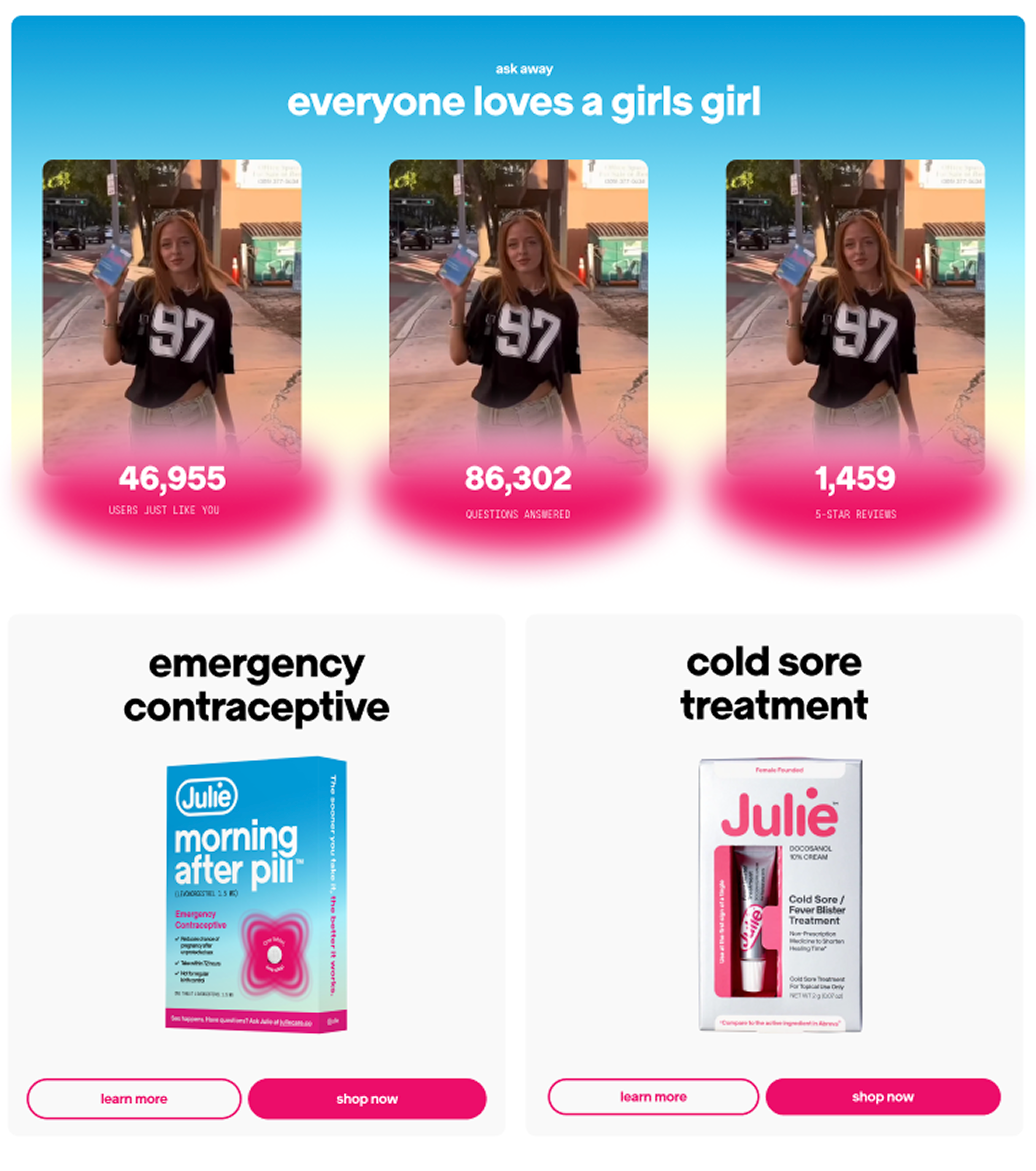
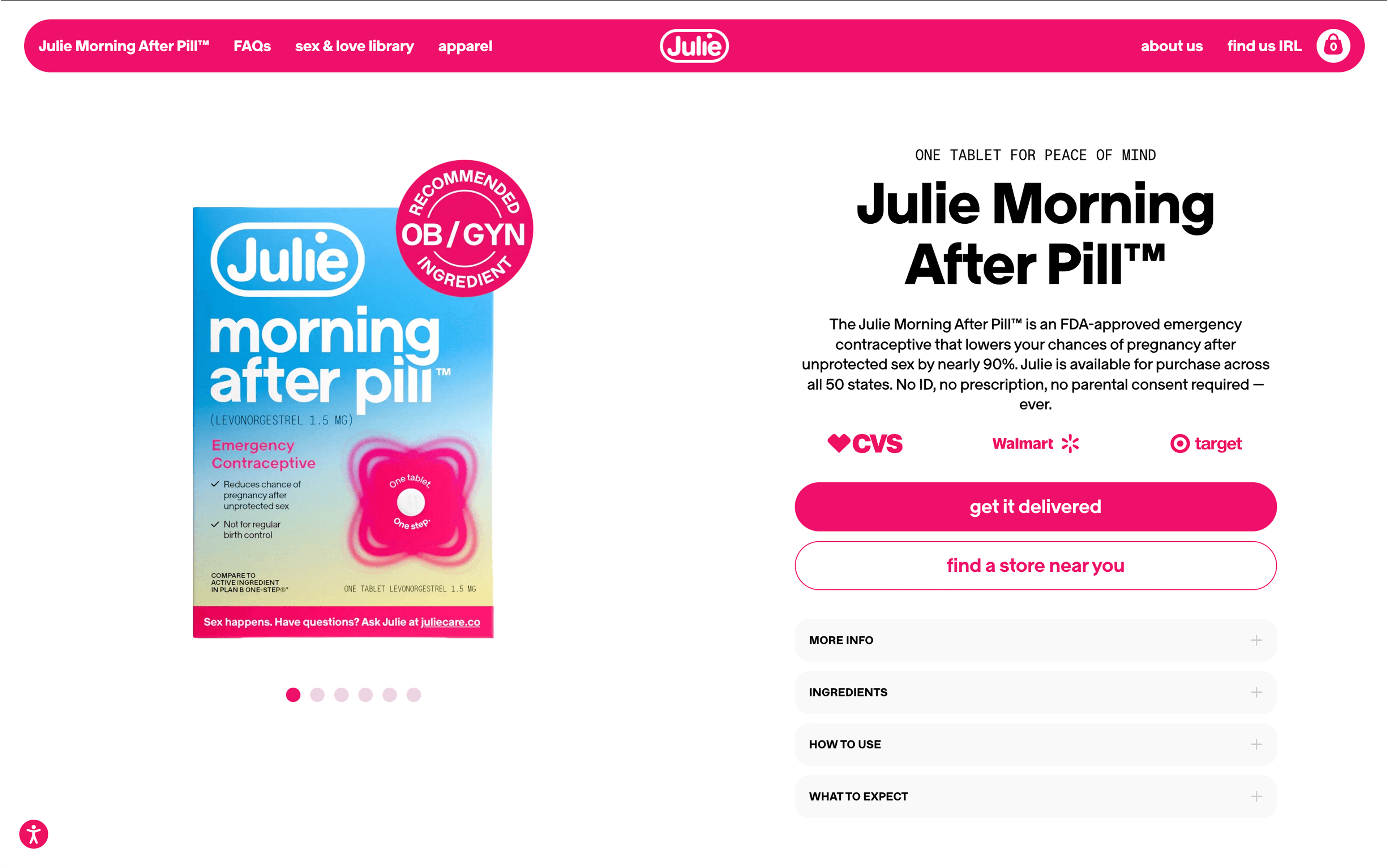
A key consideration was Julie’s primary revenue driver: its emergency contraceptive pill, recognizable by its signature blue and pink packaging. While the expanded site called for a more expressive, upbeat tone, Julie’s original blues and whites anchored the design, preserving the clinical trust of the product experience while supporting the warmth of the new health resources.
Final direction
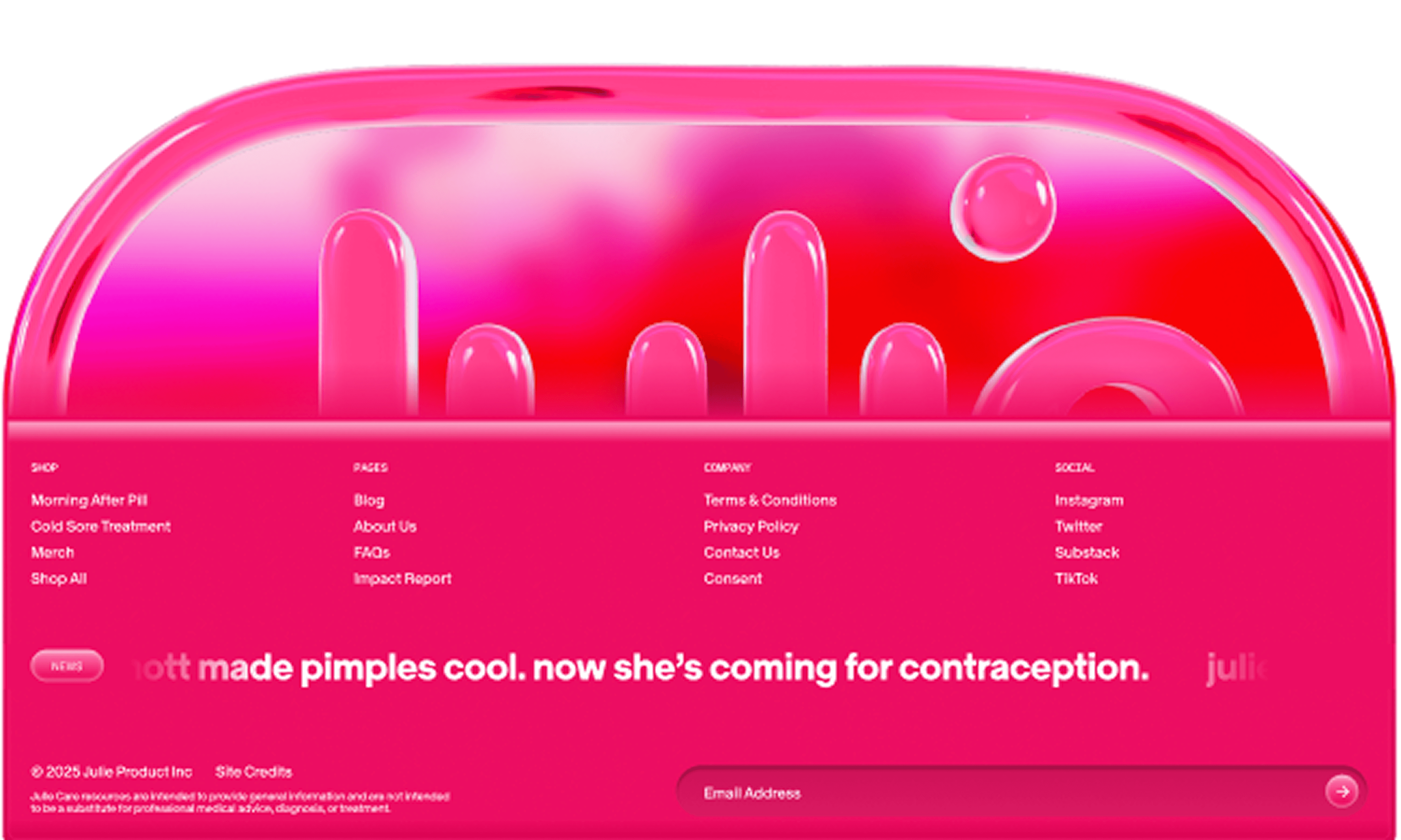
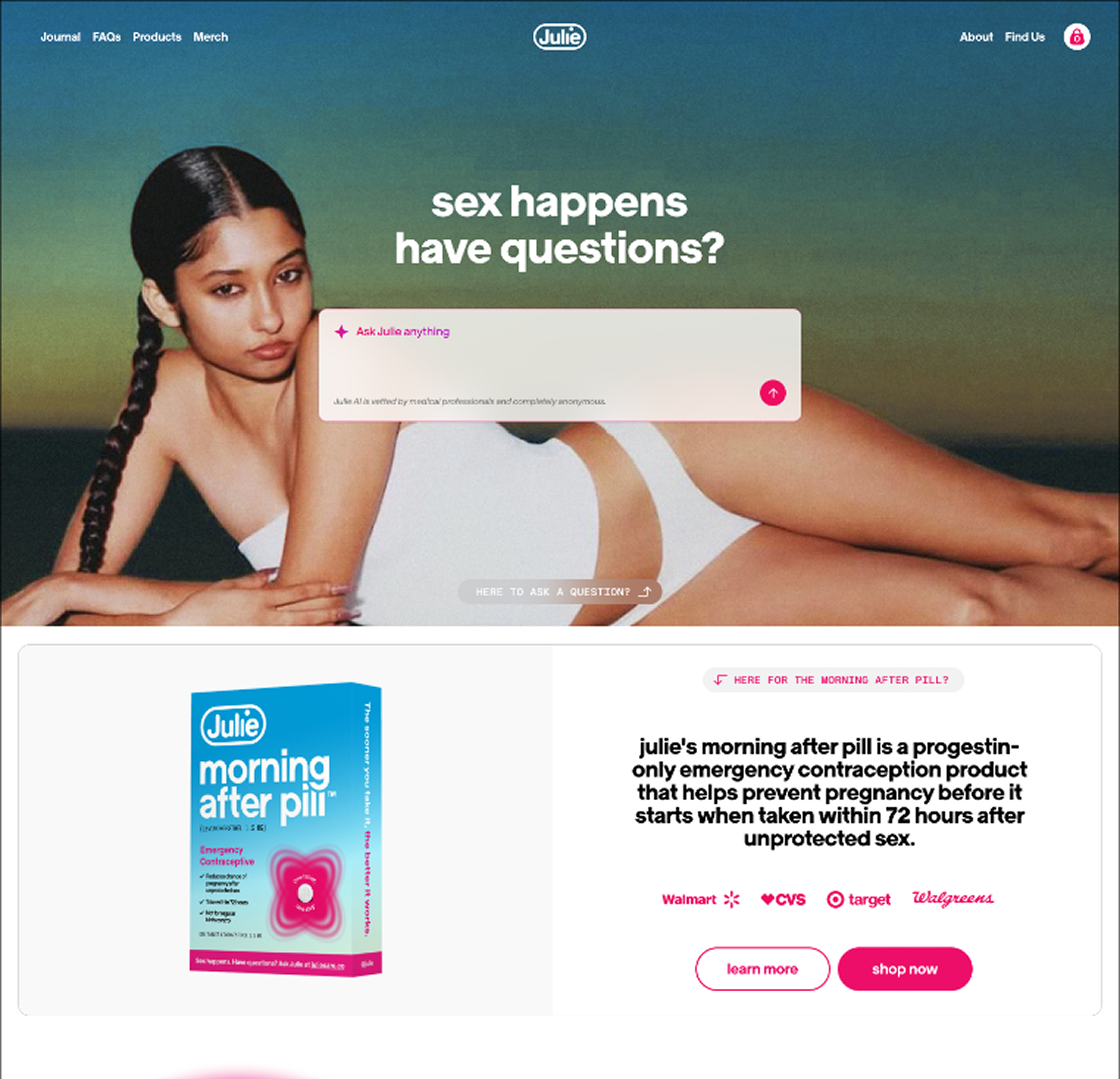
The final system pairs soft pinks and whites with Julie’s signature blue gradients, creating a clean, readable experience that feels familiar to existing customers. The design applies a kind of progressive disclosure to the visual system: core product pages stay restrained and trustworthy, while deeper resource pages introduce more playful, expressive visuals that engage users as they explore.
Credibility
The new articles page with reviewed medical articles did not visually uphold the sensitivity and scientific nature of the subject material. Julie’s site lacked the medical credibility that would keep users coming to Julie as a first resource for medical advice. Before trying to uplift and handle sensitive health questions, users need to see Julie as a place with healthcare professionals providing essential information.
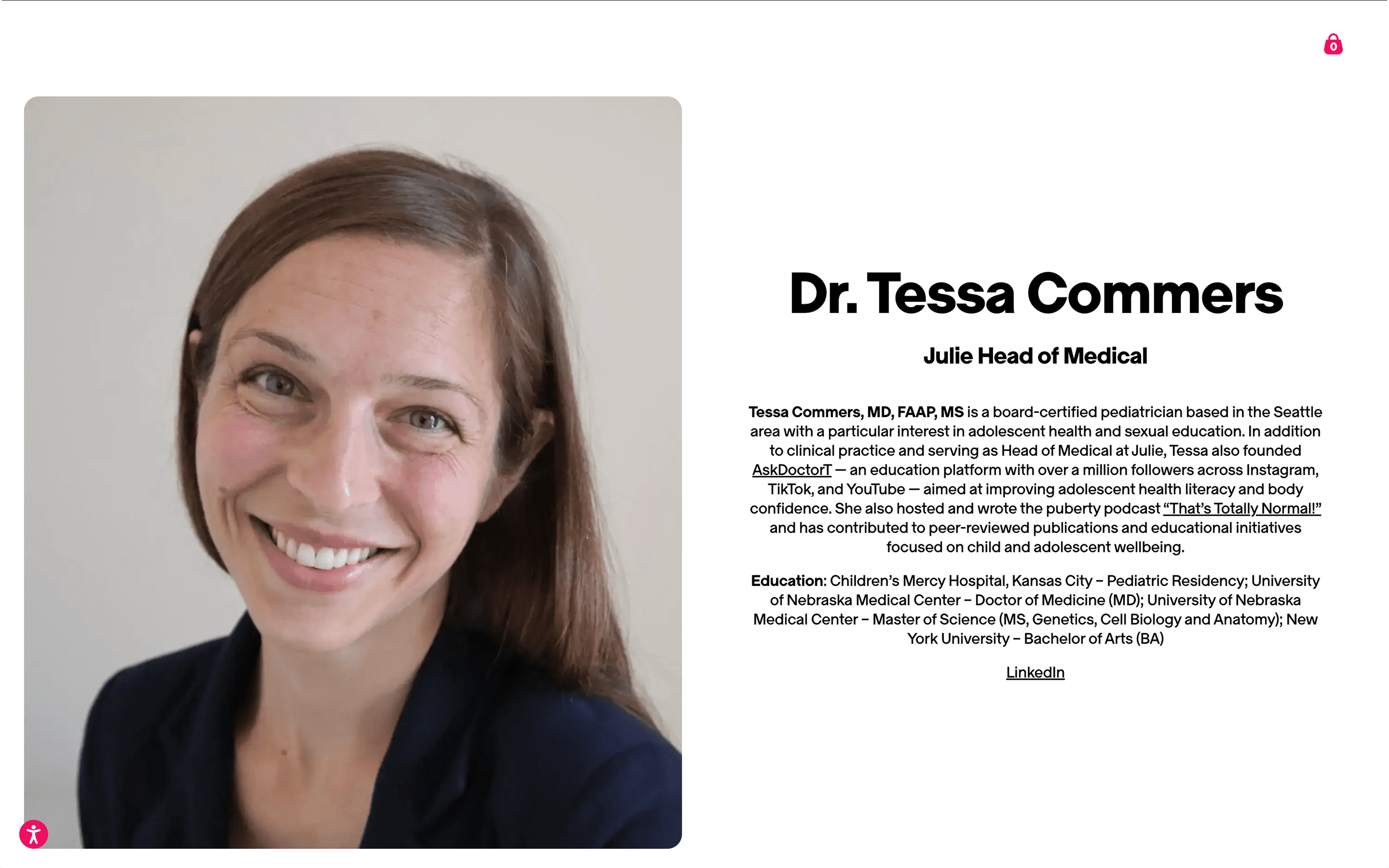
Upon identifying the clear gap between medical professionals and medical advice, I created a low-fidelity wireframe of medical team pages. These pages feature professional headshots, education background, and work history to create a sense of much needed professionalism.
Human-AI Interaction
Before final rollout, we turned our attention to Julie’s newest feature: an AI assistant powered by Ema, a generative model trained exclusively on medically reviewed data and scoped solely to reproductive health questions. Because the assistant handles sensitive health information and is designed to be conversational rather than clinical, it was essential that Ema’s interface align with human-AI interaction principles that felt safe, supportive, and trustworthy.
Placement
Where to put the AI was a genuine debate. As an innovative, newly implemented feature, there was a case for keeping it accessible at all times, citing that persistent visibility would encourage use and signal that this wasn’t a typical healthcare site. But, a chat widget on every page risks feeling gimmicky, and worse, it could pull users away from the articles and FAQ sections that anchor the site’s credibility.
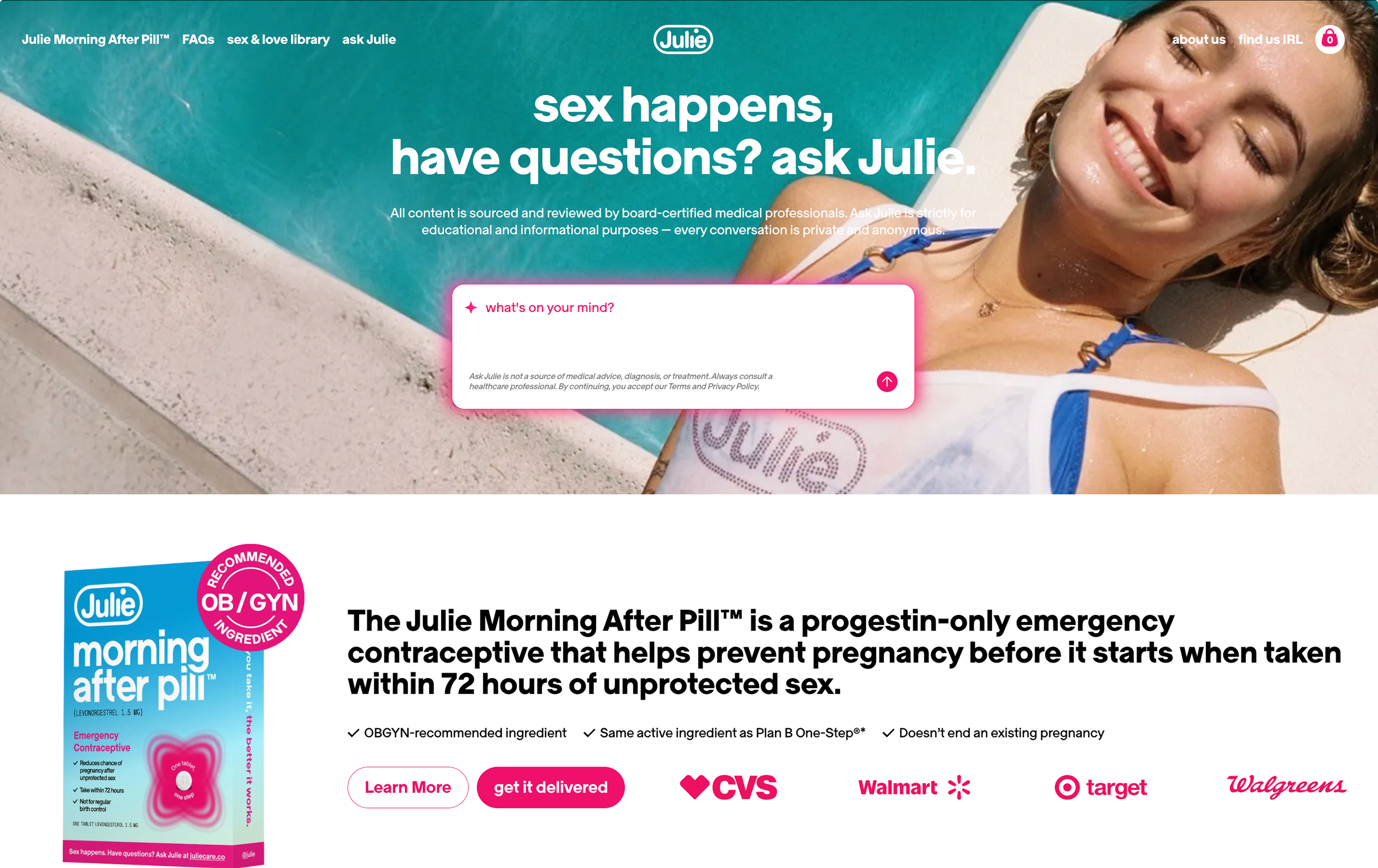
We advocated for anchoring the AI beneath the FAQ on the homepage rather than floating it site-wide. The solution that ultimately landed was a sticky bar, or a small, unobtrusive strip fixed to the bottom of the screen. It keeps the assistant available without demanding attention, persistent without being pushy.
Conversational design & AI interface
A key part of the AI was the experience it provided users, especially those who may be in a more vulnerable place concerning birth control, pregnancy, and other reproductive topics. The process of vetting the AI was crucial to ensure a positive user experience, which relied on everything from the actual interface and features provided to the language used when responding.
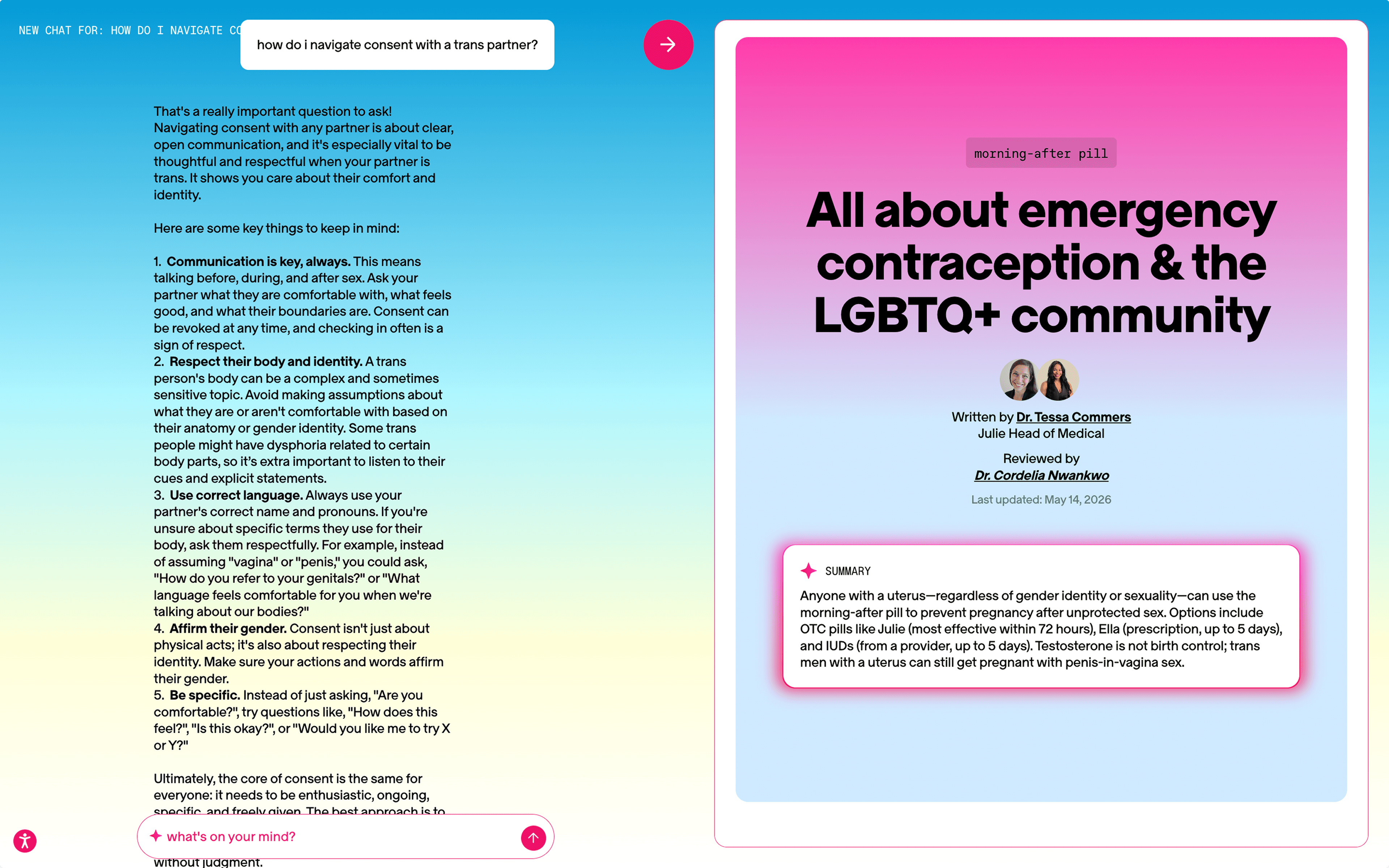
The AI excelled at inclusivity, using supportive, comforting language that aligned with Julie’s shame-free mission. However, the interface itself slowly became more overwhelming and cluttered as more information was provided by the AI. For example, the AI references existing articles on the site and allows the user to split-screen the article and conversation, which we hoped would help with user engagement and trust.
In practice, the interface became unintuitive, and toggling between the different parts of the interface (the article, close button, exiting back to the site) became difficult. We suggested a slider-controlled split-screen view to aid user control while preserving the connection between the user, AI, and medical information.
FAQ Section
The original FAQ page presented itself as an extensive, intimidating list of questions ranging from side effects to before and aftercare of the EC pill. This overwhelming and exhaustive list created a sense of fear rather than a sense of genuine curiosity or interest.
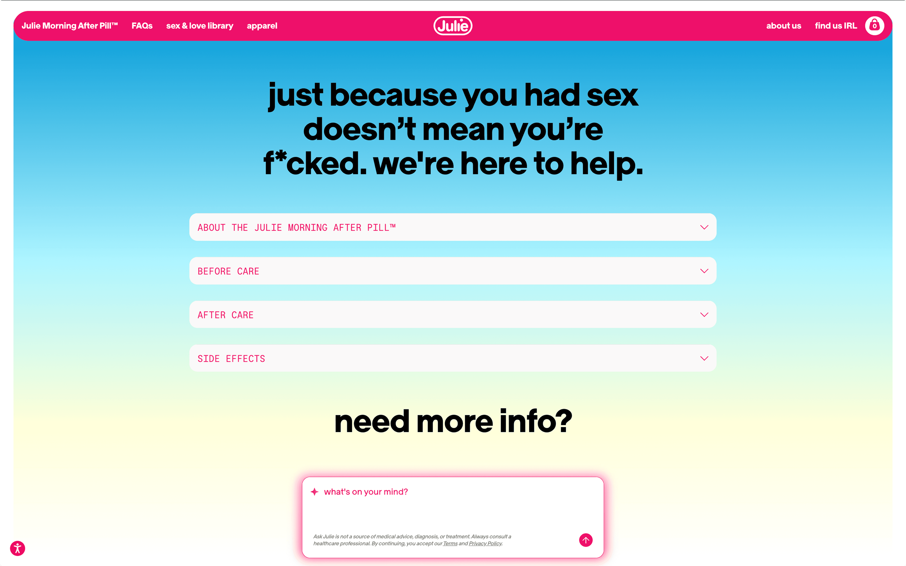
The intern team advocated for a restructuring of the FAQ page, namely for two things: modularity and reframed language.
Our mockup splits the questions into expandable drawers with just the subject clearly labeled above. Without the subjects, it almost seemed the whole list was about the EC’s side effects, but a clear text hierarchy helped with making it readable and clear the FAQs were more than just the pill’s effects.
Article Library
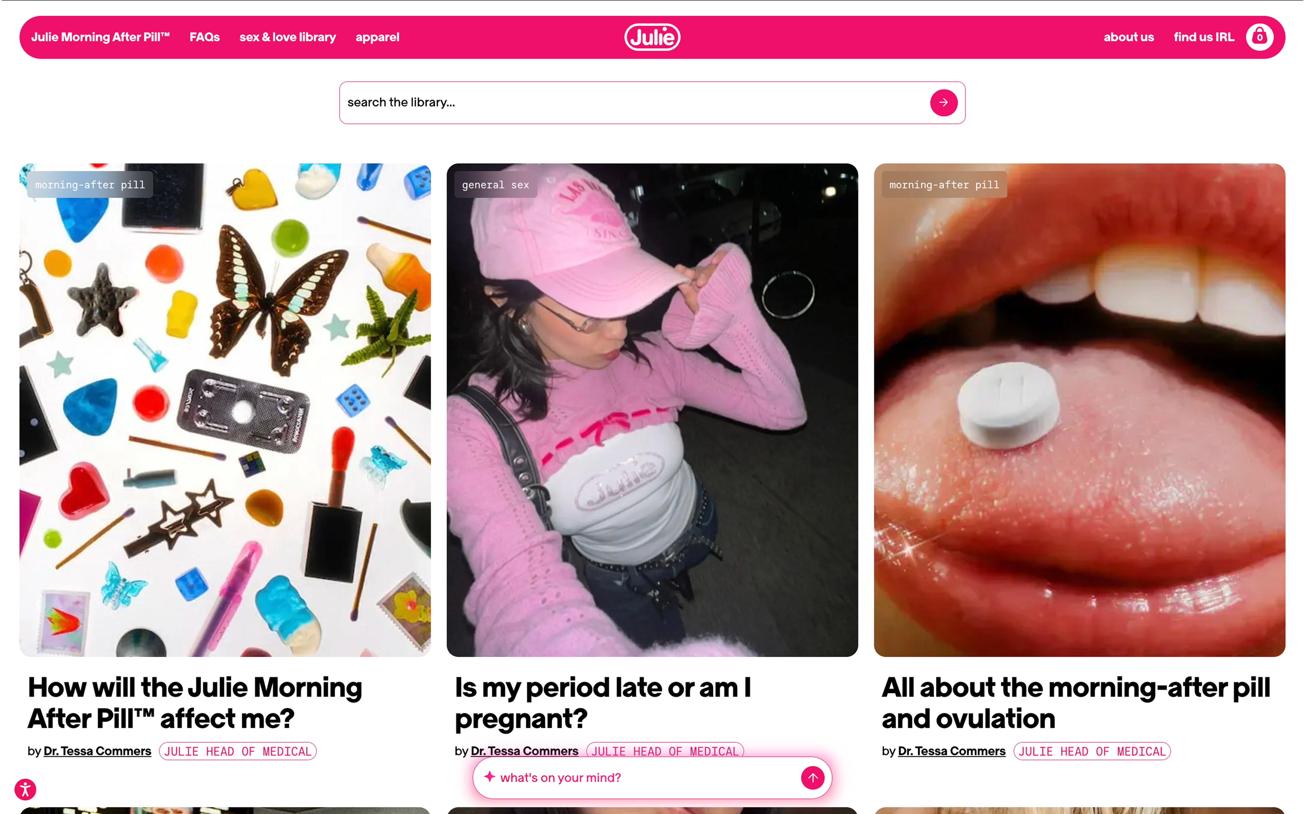
The article grid used a card layout with tags, titles, and small credential tags beside medical authors’ names as a direct response to the credibility challenges identified earlier. The system worked, but the cover images introduced an unexpected tension: the Pinterest-style aesthetic read as culturally relevant, but visually undermined the medical authority of the articles themselves. Without clearly related imagery, the grid felt less like a curated health library and more like a lifestyle blog.
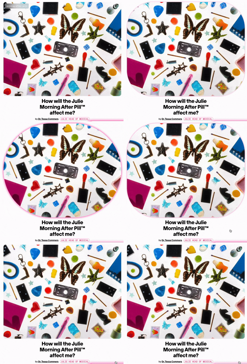
The static quality of the page compounded this; the layout felt closer to a collage board than an interactive, information-rich experience. To restore a sense of life and play, we introduced hover effects on article cards: a soft pink outline and rounded corners that animate on interaction. The effect adds personality without sacrificing credibility, signaling that the site is warm and inviting, but still a place you can trust.
Final Designs