Claris
- Timeline
- 3 months
- Role
- UX Researcher
- Status
- Shipped, in active beta
- Project Tags
- B2B SaaS, Web App, AI
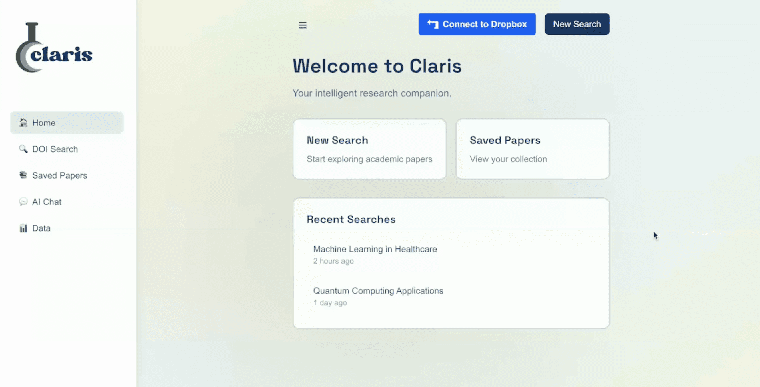
Claris is a research workspace that unifies the files labs depend on (papers, annotations, protocols, and data) and pairs them with an AI assistant scoped to each lab’s own material. My role was turning a broad frustration with lab tools into a focused product: defining the problem, deciding what not to build, and shaping an experience researchers could trust.
Framing the Problem
Our team had seen lab inefficiencies firsthand, and funding cuts were pushing labs to drop expensive tools. Before designing anything, we tested whether our experience was representative through interviews with researchers across disciplines and experience levels.
The pattern was clear: research labs are held back by fragmented, expensive tools that make iteration and collaboration difficult. Researchers also wanted AI, but didn’t trust existing LLMs with unpublished data or with facts.
Two findings became design requirements, not just insights:
Trust
Unpublished data cannot leave the lab, so security had to be visible in the experience, not just in the architecture.
Accessibility
Technical fluency varies widely, so nothing could require setup or expertise.
We defined success as adoption across labs and individual users, engagement with resources, and researcher confidence in the tool.
Finding the Right Scope
The hardest product decision was what to leave out. We explored three directions:
“Notion for researchers”
A collaborative workspace. It was too broad to differentiate from tools labs already had, and it didn’t solve their core pain.
A one-stop shop
Paper search, data cleaning, and Dropbox integration in one platform. It did everything adequately and nothing well, and it broke our commitment to simplicity.
The final direction
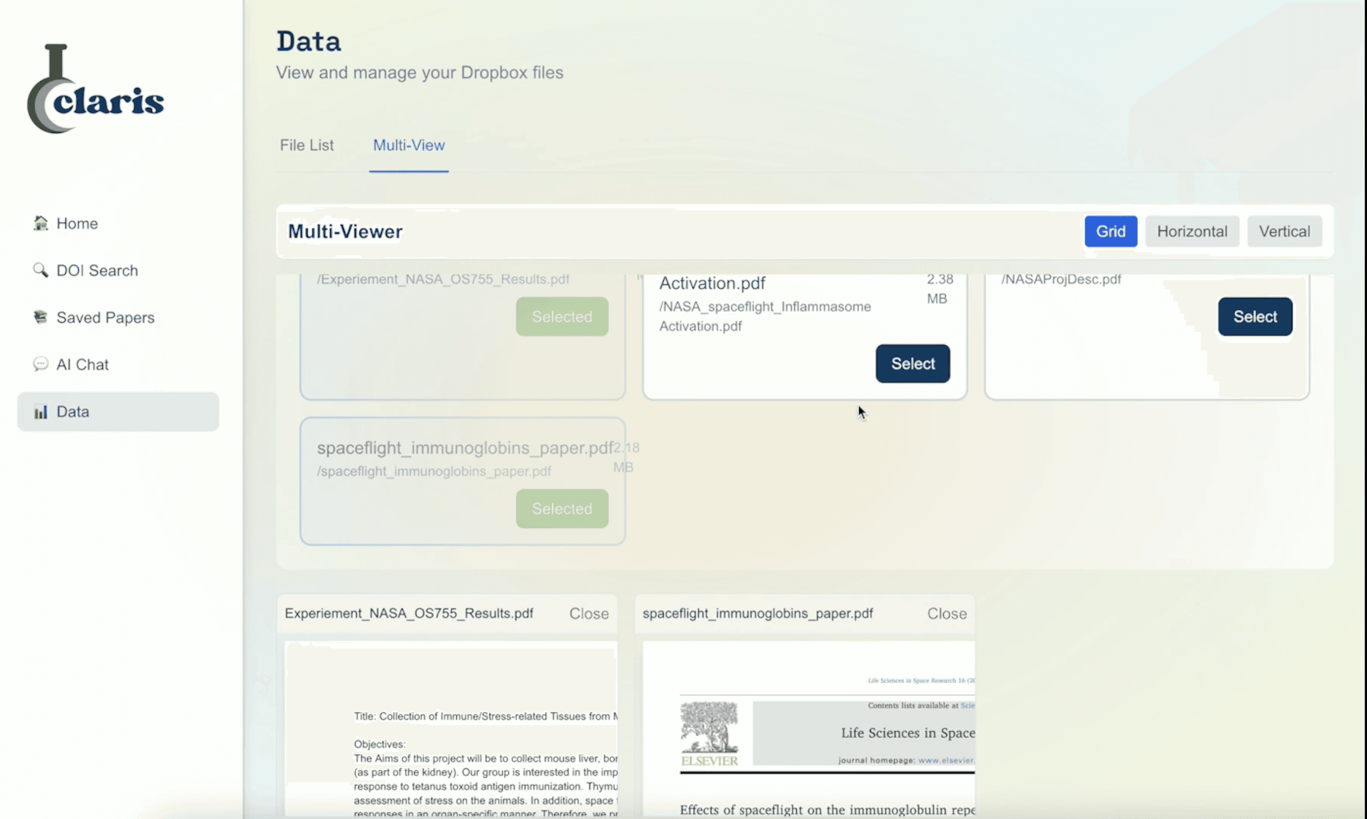
Streamline one critical part of the workflow, the documents researchers constantly reference. Easy conversion from existing files let labs start where they already were instead of migrating their work.
Designing for Trust
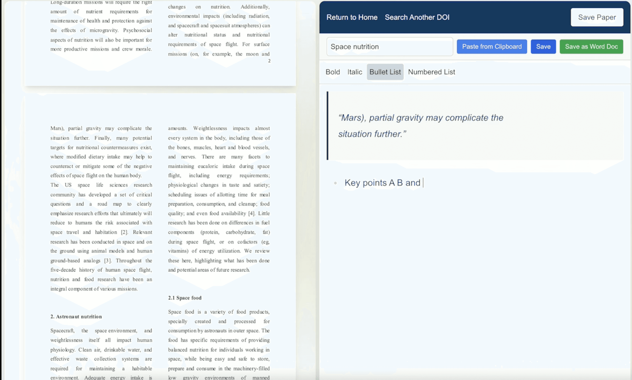
The PDF annotator puts a paper side by side with a rich-text editor, using contrasting colors to separate quotes from a researcher’s own thinking, which is a small distinction that matters when notes become citations.
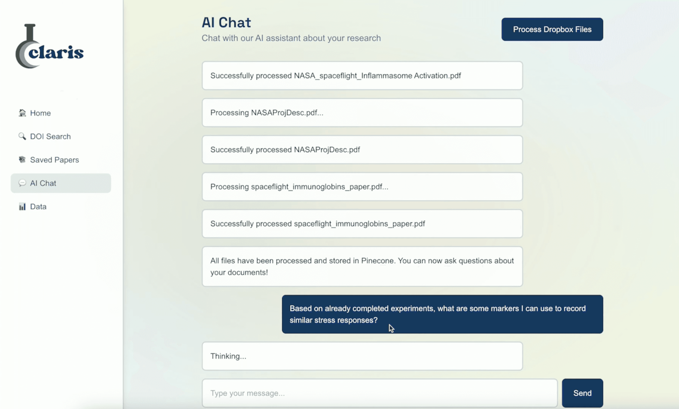
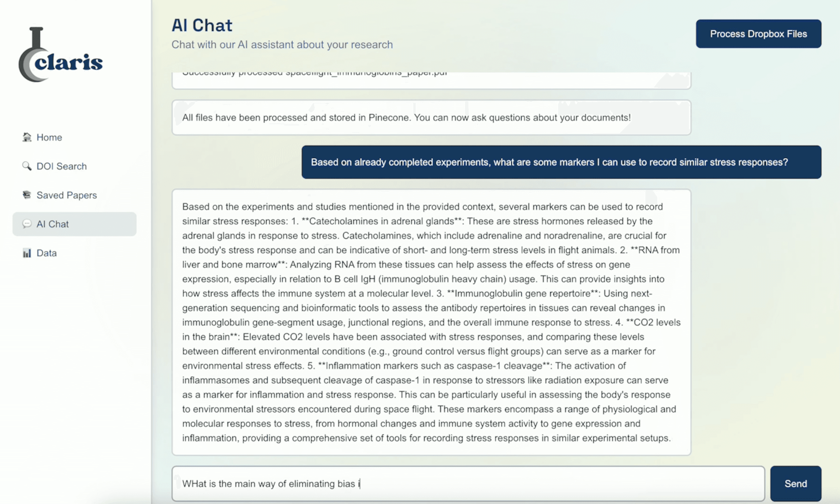
For the AI assistant, the engineering answer to trust was retrieval-augmented generation limited to a lab’s Claris files, with session-specific models that don’t store data. The UX answer was making that legible: inline querying, a minimal interface, and clear indicators of exactly which materials each answer drew from. Researchers don’t have to take security on faith; they can see where every response comes from.
Outcome & What’s Next
- 10+labs onboarded
- 50–70active researchers (est.)
- 25+individuals who sought it out on their own
Claris is in active beta with 10+ labs onboarded, an estimated 50–70 active researchers, and 25+ individuals who sought it out on their own. That organic adoption was the strongest signal that the narrowed scope was right. The next product challenges are scaling security for full deployment and building a sustainable model for AI usage costs at scale.